Analysis on the four websites.
3) http://www.mangareader.net
ESPN is the managing sports showing web in the world. Millions
answer on ESPN for up to date sports data every single solitary day. Although
its obligation to hold up to date sports data to its viewers, ESPN's website is
a main disappointment. In m y opinion, ESPN's website does not efficiently
present sports data to internet users. There are countless reasons for ESPN's
disheartening website, encompassing unkempt data alongside out of locale ads,
slowness on discovering data, lack of user forums, hard to pursue play-by-play
data, and unbalanced representation of items.
Cluttered and Non cohesiveness.
fig 1
Option is an outstanding feature that ought to be added to ESPN
website because it permits for users to attain admission to data swiftly and
not have to rubbish period traversing a website. To illuminate the necessity
for instant search. In my opinion, ESPN ought to endeavour to incorporate the
instant find skill for scores of games and contestant data because it proposals
users the luxury of fast data lacking possessing to rubbish time. Otherwise
people could become capitulated in the colossal number of data on the website
and not find what they are looking for.
Lack of User Forum.
fig 2
The reason for this is basketball moves so swiftly that one cannot
perhaps pursue the game by discerning a computer generated representation. This
can even be misleading because merely one contestant is shown at a period and
it does not display the moves of supplementary players. I have to favour Yahoo!
sports naive way that merely displays the present plays alongside the team's
logo displayed. ESPN.com is far too hard
to pursue and doesn’t truly display all the data that is going on across the
game. In my opinion ESPN ought to whichever enhance this feature to make it
extra user approachable or do away alongside it all together.
fig 3
Finally ESPN website is can be used by ages ranging from 11-40 years of age. Its a site with so many adds, which makes the user confuse at times.
2) Anime joy tv.
Over the period it has been ranked as elevated as 30 749 in the
globe, as most of its traffic comes from USA, whereas it grasped as elevated as
11 246 position. All this period it was owned by Erne Altiparmak of Manga, it
was hosted by Rens Ariens interchange as "Your Internet Service
Provider" and Cloud Flare Inc.
Animejoy has the lowest Google pagerank and bad aftermath in words
of Yandex topical citation index. We discovered that Animejoy.tv is poorly
‘socialized’ in respect to each communal network. According to MyWot, Site
advisor and Google harmless browsing analytics, Animejoy.tv is a fully
trustworthy area alongside no visitor reviews.
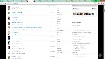
fig 4
The white space on this isn’t proportional but still visible. In
the picture above shows the top part of the site, which is the only part that
shows visual images and stock motion videos on anime advertised on the site.
It’s a user friendly site, age ranging from 12-28 years old. Its easy to use
and play around with. The top rectangular shaped screen shows the different
animes depending on the dates and version.
fig 5
This part of the site page shows different names of animes
available to view, with pictures and videos. Peoples comment are also seen
below each anime videos. The site doesn’t have lots of images on it but so many
words, links and comments.
Mangareader.net was registered 6 years 3 months ago. Instituted on
Alexa.com ratings, mangareader.net has a globe traffic locale of #1,634. It
receives concerning 919,641 exceptional visitors and 7,357,128 page sights each
day. Mangareader.net makes $ 7,357.00 each date and we approximated its worth
as $ 7,945,560.00. This area has a Google PageRank of 4 out of 10. Its Area
Power is 46/100 as each Moz. The server of mangareader.net is physically placed
in Turkey.
fig 6
Mangereader.net is a site a user friendly site. It’s very easy to
us, the options on the site is simple which makes it easier for kids to use.
This picture above is the front page of the site, it has four pictures which
advertises different manga’s. It doesn’t have pop up videos on the site or
drawings. The site to my own opinion is boring it doesn’t look interesting to
me.
fig 7
It has a lot of comments from the top of the page till the end
below, and have adverts of other manga on the side of the page. Lots of white
spaces in-between and less images and pop up images.
fig 8
White
spaces found on the sites are equally at both sides and in between the movie
adds. It brings beauty into the site, each movie is visible. The front type on
each movie add is different. It takes
the genre of the movie displayed. If its adventure, horror, action and
romantic. And the colour some are and some are not.
This
site is used every second in a day, it’s a cite that has constant followers
because it has new series and movies every day. It keeps people entertained.
People between the ages of 13-28 years are usually use the site. This site is
like ABC, because each movie add on the site is big and visible enough to see
and understand between each movie.
fig 9
This site is
for people from age 13-35 years now they have not diverted from their main
propose.
Proportion.
The
Balance, length, size and proportion of the site is properly design and okay.
Generally
in my own view this site is okay, the design and proportion is quite good.
WEBSITES.
moviez.se/tvseries/
espn.go.com/
www.animejoy.tv/


No comments:
Post a Comment