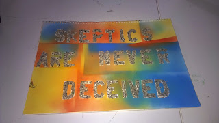
Task 1
19/10/14
Anatomy of Typography
Definition
Typography is a design or selection of letter
forms to be organized into words and sentences and printed or displayed
electronically.
History of Typography
Typography
originated after the invention of printing from movable type in the mid-15th
century. The three major type families in the history of Western printing are roman, italic, and black
letter (Gothic). All
had their origin in the scripts of the calligraphers whose work was ultimately
replaced by printing. In the succeeding centuries typographers have created
some 10,000 typefaces (a complete set of letter forms of a particular design).
Depending on the style of their letters, typefaces are categorized as old
style, transitional, and modern. Commonly used typefaces include Caslon,
Baskerville, Bodoni, Garamond, and Times New Roman.
Alphabets evolved from drawings of early man into
pictographs and ideograms. An ideogram or ideograph is a graphical symbol that
represents an idea, rather than a group of letters arranged according to the
phonemes of a spoken language, as is done in alphabetic languages.
Typographic terms all designers should be familiar
with. Here are the main topics:
What’s in a Letter?
Serif and Sans Serif
X-height
Measuring Type
Spacing
Typographic Colour
Using the Right Character
Alignment
Copy
fitting
Choosing and Using Typefaces
Combining Typefaces in a Publication
Glossary of Typographic Terms
Advantages of
Typography.
1) Trendy Design: These are flat designs, I believe
they are perfect for blogs and if you love it all sort of designing will be
fun.
2) Usage of bright colours: flat
designing are mostly bold colours because such colours put visitors in a good
mood. (Enlightenment)
3) Perfect for mobile phones: Mobile devices have small
screens and they cannot handle too much of clutter that’s why the typography is
small and fit able.
Disadvantages
of typography:
1) Trends have short life span: Well, we all know that
everything trend that hits the designing world has an ending and same goes for
flat design. You never know when the sun sets on flat designing.
2) Usability issues
may arise: A
lot of people are not comfortable with minimalistic approach as they believe it
affects the functionality of the website since designers are trying to keep
things simple.
3) Harmonious Colour Palette is difficult to find: Creating a nice colour palette is
not at all an easy task. A combination is easy if you plan to use 2 colours
however, if you plan to use 4-5 colours, creating harmony between them is not
at all an easy task.
Roman:
The
Roman alphabet is the product of a long series of simplifications and
refinements. Like other forms of writing, its most distant ancestors were
tallies and pictograms. These evolved into ideograms which, in turn, resolved
themselves into phonetic symbols — first symbols representing syllables, then
signs indicating consonants, and finally letters standing for both vowel and
consonant phonemes. The Greek alphabet achieved this final step. Simplification
of signs involved ease in writing and reading as well as emphasis on smaller
units of sound.
Uses
of Roman lettering
1) Romanian are used to provide emphasis or
contrast in running Roman text.
2)
The Roman lettering are used for foreign words or phrases not considered fully
part of the English language.
3)
They are used to start a noun word example some ones name, Ikon.
4)
Use Roman lettering to denote titles.
5)
Roman lettering are used for vehicles plate numbers.
6)
Use to practice test in the Tips section to improve your knowledge of when to
italicize text.
Examples of Roman Typography.
Work Done by Ikon
How it applies to me.
Roman lettering is more on the straight
and bold of the letter, how the stand erect. It’s actually more of stenciling because its takes time to create lettering but to get the actual forms and
shape you must use guide lines. I prefer Roman because it’s has directions.
Reference:
Adams, C. J., n.d. Roman
lettering, oxford word press. s.l.:s.n.


No comments:
Post a Comment